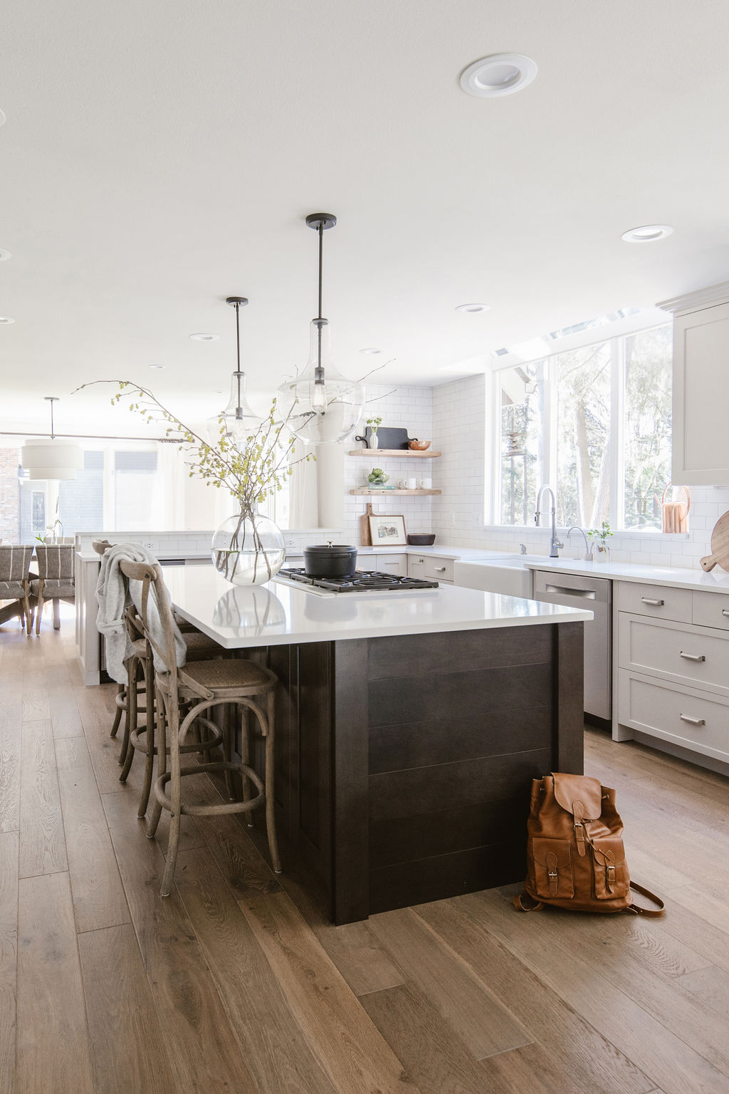
When I first met with these clients, they were considering looking to make their home more functional by remodeling the kitchen, dining, and living room areas and updating their furnishings. As a busy family of five, however, the burden of making all of the decisions weighed heavy on them. They were worried also about making the right choices in furniture that would make sense to have with their active children. Hi, that is why I am here.
The Problem:
This beautiful family home is nestled amongst the trees in Redmond, WA. The biggest complaint that my client made was the lack of natural light. The home felt dark and closed off. The main living area is on the back of the home where the large beautiful trees block a lot of the natural light that might come in the home. So we had to figure out a way to capture more light. She also said she never felt like the home was truly her style and never felt like “her”.
The Solution:
Open it Up
We knocked down the wall that used to separate the kitchen and the dining room which has beautiful, large, south-facing windows. Doing this instantly opened up the whole space and allowed light to come into the rest of the space. The next step was taking down those unnecessary beams that obstructed the view and really cut the space off.


Let in the Light
Believe it or not, we also took out a window on the other side of the fireplace (which also received a huge makeover). But we replaced it with a HUGE Nanawall that will create an amazing connection with the client’s huge outdoor entertaining deck.


Bring in the Style
The clients were not huge furniture shoppers so they had several hand-me-downs and furniture odds and ends that didn’t work well with the space and also felt heavy and dated. In the dining room, we added a large new table and a fun mix of chairs. The breakfast nook got a custom upholstered bench and a fun statement light.
The living room received the ultimate treatment with a new lounge-y sofa and a pair of cute swivel chairs, both in performance kid-proof fabric.


We added a comfy ottoman that serves as a place to put up your feet or throw a board game down onto. The client was SO worried about having open shelving because she was worried it would look cluttered. I carefully curated every single shelf with a balance of books, frames, and fun objects. Over time they can fill in these areas with similar mementos and the frames can be updated with new photos.


I love styling clients’ homes so that it truly does feel like their own space that they can use and enjoy. Working on this project was a fun challenge to create an impact on how the family can now use the space. Let me know what you think!
Project Details
Designer: K. Peterson Design
Photographer: Poppi Photography


[…] twist, so I’ve curated a collection of Thanksgiving tablescapes photos that resonated with my design aesthetic – and a few that are a bit different than what I normally gravitate toward, but that I still […]
[…] maybe I have a theme going here of neutral+simple fireplace design, but this one is just too good to skip over. I actually really love the smooth plastered look here […]
Hi there! Can you share flooring and kitchen cabinet colors and island stain? Thank you!!