
One of the most frequent questions I get as an interior designer is what paint color I’ve used in the projects I share both here and on social media. I’ve had the opportunity to experiment with lots of different colors over the years, but have narrowed it down to a few favorites that I love to come back to time and time again. I’ve selected four of my favorite paint colors in white, four of my favorite paint colors in black, and lastly, four “other” paint colors that I also love—all are by Benjamin Moore. Why all by the same brand? I believe Benjamin Moore is a great in-between color manufacturer. None of the colors are “pure” anything (i.e. pure black, pure white, pure red, etc). I like this because it makes the colors more like chameleon colors that work for a lot of different environments—what looks good in one person’s space, will look completely different in another’s space. I liken it to wearing makeup, what foundation looks good on one person’s face, won’t work on someone else’s face. I also prefer the quality of their paint. It covers nicely and the sheens are perfect.
My number one tip for choosing paint colors:
SAMPLE, SAMPLE, SAMPLE. What works on one wall will look completely different on another wall. Buy poster board and paint the samples on there, that way you can move them around!
Ok, now let’s get into it!

Favorite White Paint Colors
White Dove by Benjamin Moore

I painted the walls of my kitchen in White Dove. It’s a popular choice for a reason! As you can see from the photos, it leans a touch warmer, but overall is fairly neutral, soft, and creamy white with greige undertones—not overly warm or cool, and not a true white.
LRV: 85.38 – The LRV, or the Light Reflective Value, is a scale from 0-100 that designers use to gauge how much light is reflected from the surface. A value of 0 indicates absolute black, and a value of 100 indicates a pure white.
Simply White by Benjamin Moore

This is my daughter’s room, and I went with Simply White by Benjamin Moore on the bottom half of the walls. It’s a bright, fresh white without being too stark that’s popular for ceiling, trims, and walls. What I love about this particular shade is that it isn’t too warm or cold yet still creates a light and airy feel.
LRV: 91.7 – As you can see, this is getting very close to the 100 ‘pure white’ area, making it a clean, crisp pick.
Chantilly Lace by Benjamin Moore

My kitchen cabinets are all painted in Chantilly Lace and I love the brightness it brings to this space. If you want a crisp, clean look with still a slight touch of softness, you really can’t go wrong with this pick.
LRV: 92.2 – This white is even closer to 100 than Simply White above, making it whiter and brighter.
Swiss Coffee by Benjamin Moore

I actually had a painting fiasco a while back where I chose a paint color for my home, after the first coat decided it was too yellow, then asked the painter if he could switch it to Swiss Coffee …and THANK GOODNESS I did! It’s the perfect creamy shade and on my home’s exterior reads white without being blinding. It’s a wonderful pick for a neutral white that will bring a slight soft warmth to the space it’s in, as seen here in this beautiful kitchen by Studio McGee.
LRV: 83.93
Favorite Black Paint Colors
Soot by Benjamin Moore

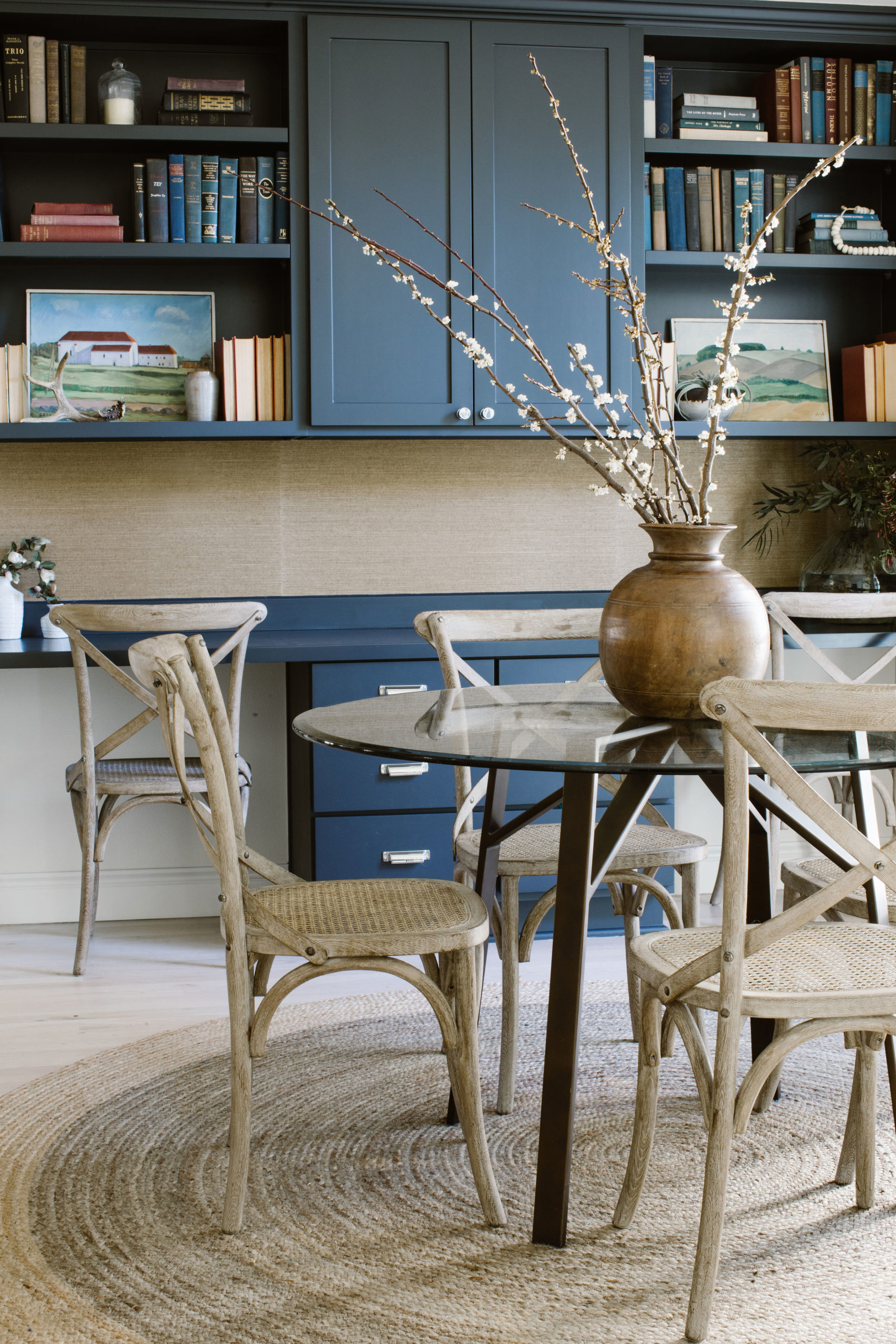
If you want a navy that has more black in it, then this is a great option. I painted my breakfast nook built-ins in Soot and love the moody and bold pop of color it brings to the space.
LRV: 4.11 – Now we are getting closer to the opposite end of the color spectrum, where colors are closer to being absolute black. While Soot is dark, it isn’t black and still has hints of gray and blue in it without coming off as too cold.
Onyx by Benjamin Moore

This black paint color is closer to a classic, true black that works really well in traditional interiors that need the crisp touch it gives.
LRV: 2.9
Black Satin by Benjamin Moore

Black Satin tends more on the charcoal side, but is more of a softer black – it’s a super dark charcoal color before being absolute black.
LRV: 2.49
Wrought Iron by Benjamin Moore

Wrought Iron is a perfect charcoal color. A lot of grays read too blue, too purple, or sometimes too green. This reads like a true charcoal color with neutral undertones. In an interior space, it gives a moody feeling, on an exterior, it’s a great classic dark gray.
LRV: 6.16
Other Favorite Paint Colors
Edgecomb Gray by Benjamin Moore

Edgecomb Gray is a perfect greige color. This could be great on walls, trim, doors, cabinetry and is really versatile.
LRV: 63.88
Pale Oak by Benjamin Moore

Pale Oak is the perfect in-between of griege and gray. Be careful as it can read a little purple/blue and can be influenced by flooring or even the exterior like a lot of trees.
LRV: 69.89
Dark Olive by Benjamin Moore

I’m biased because this is my powder bath, but it’s a perfect forest hunter green that speaks to more classic, historical colors.
LRV: 11.91
Bashful by Benjamin Moore

Bashful’s not too saturated and I like it because it gives you a hint of pink without committing to a really intense pink color. This is great for secondary spaces like kid’s rooms, powder bathrooms, etc.
LRV: 72.48
Marie, I just found your information . Could you please help me with the color for kitchen cabinets with Massa Quartz ….white with black and gray streaks. I’m tihnking of Pale oak semi gloss as the floor has a grey marble on reddish brown tile. The open concept walls are Revere Peuter
What is the trim color and ceiling color you have paired with the dark olive in this photo? Do you think dark olive coordinates ok with white dove walls and revere pewter trim and doors?